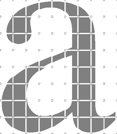
 Take for instance the seemingly simple, at the very beginning, start it all off, first letter of the alphabet: A or a.
For most kids, that little guy belongs to 'apple' -- 'a', 'apple', 'ah' (except it's not meant to pronounced like you're having your tonsils checked; your supposed to pronounce it like a New Yorker or a Bostonian!)
This is kind of an important letter; it's seen in lots of important words like cat, map, waste, and academic annihilation!! Unfortunately, this booger can really lay a kid low if he or she can't manage to wrap their fuzzy little heads around this particular squiggle.
And to make matters worse, font masters have to go and fuck things up for these poor kids by providing so many letter shape varieties.
The problem with "a's" is that they often show up looking quite different in just about every kind of text a kid runs across. For instance, Times New Roman likes to use their funky "a's" (with its weird Buddha belly and strange swoop-y toupee at the top) and Comic Sans likes to employ what I call the primary or Kindergarten letter "a" (with its simple round "o" and straight-backed line). Which one is the real "a"? Well therein lies the rub. Kids are expected to write one type of "a" and be prepared to read/identify (with a hitch) several different other kinds.
And we won't even get into the issue of italicizing letters (as well as all those different "g's"and "q's")!
Learning to read --especially for kids who struggle with partially wired brains, brains that like to "flip" images, or brains that like to make images "float" around before identifying them-- can be a real special kind of hell. And for me, it's terribly frustrating to see them struggle so hard to make out those inane distinctions while trying to put all those arbitrary symbols together into a coherent whole. It's a wonder so many people manage to read at all.